- Home
- Improve Paintings
- Common Mistakes
How to Spot and Fix Common Painting Mistakes
Every artist can run into common painting mistakes. There are moments when a painting just does not seem to work.
The subject may be good, the drawing may be sound, and the technique may be fine, yet something still feels wrong.
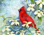
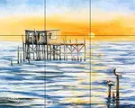
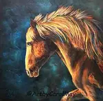
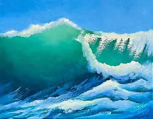
Very often it's a design issue. Many painting problems come back to composition, focal point, and values. When one of these is weak, the whole painting can feel awkward, flat, confusing, or unfinished.
 You can fix mistakes.
 You can fix mistakes.
Common Painting Mistakes
This page is a quick troubleshooting guide to help you identify what may be going wrong. If you discover the problem, you can often improve a painting much faster.
If you are looking for medium-specific help, you can also visit my pages on correcting mistakes in watercolor and mistakes in oil painting.
Does the Composition Seem Off?
Composition is the arrangement of shapes, objects, and spaces within a painting. A strong composition helps guide the eye and gives the artwork structure. A weak composition can make even a carefully painted subject feel uninteresting.
Here are some common composition mistakes artists make:
The Subject Is Centered Exactly
Placing the main subject right in the middle of the page or canvas often creates a static effect. Sometimes this works, but in many paintings, it makes the design feel stiff and predictable.
Quick fix:
Try shifting the subject slightly off-center. Even a small change can create more movement and interest.
There Are Many Competing Elements
If every object in the painting demands equal attention, the composition can feel crowded or confusing. The viewer may not know what matters most.
Artist fix:
Simplify the scene. Remove unnecessary objects or reduce detail in less important areas.
The Empty Space Feels Awkward
Negative space should feel balanced and intentional. If there is too much empty space in one area, or if the objects feel squeezed together, the composition may seem uncomfortable.
Artist fix:
Consider cropping the image, enlarging the subject, or rearranging the main shapes.
The Viewer Doesn't Know Where to Look
A good composition encourages the viewer’s eye to move through the painting. Without a visual path, the viewer's eyes may wander or leave the painting too quickly.
Artist fix:
Use lines, edges, repeated shapes, or areas of contrast to guide the viewer through-out the painting.
Tangents Distract and Weaken the Design
Tangents happen when shapes barely touch or line up in awkward ways. These small accidents can be surprisingly distracting.
Artist fix:
Overlap objects more clearly or separate them enough so the relationships between shapes look intentional.
- For a fuller explanation of strong design, see my Composition in Art page.
- If you want one simple guideline for placing your subject more effectively, visit the Rule of Thirds.
Is the Focal Point Problem?
A focal point is the area that attracts the eye first. It gives the viewer a clear place to begin and helps organize the rest of the painting.
 Can there be multiple focal points?
Without a focal point, a painting can feel scattered or forgettable.
Here are some common focal point mistakes:
There Is No Clear Center of Interest
If every part of the painting is treated with equal importance, the viewer may not know where to look first.
Artist fix:
Choose one area to be the main point of interest, then support that choice with stronger contrast, sharper edges, richer detail, or brighter color.
Too Many Areas Compete for Attention
When several parts of the painting are equally bright, sharp, or detailed, they fight with each other rather than work together.
Artist fix:
Let one area dominate. Soften or simplify the other areas so they support the focal point instead of competing with it.
The Background Draws Too Much Attention
A busy background can overwhelm the main subject. High contrast, bold shapes, or strong detail behind the subject often pull the eye away.
Artist fix:
Reduce detail, soften edges, or lower contrast in the background.
The Subject Doesn't Show-up Enough
Sometimes the subject is placed well, but it still does not stand out because it lacks enough contrast or clarity.
Artist fix:
Increase the difference between light and dark, sharpen key edges, or add a small accent of stronger color where you want the eye to go.
The Details Are in the Wrong Place
Viewers are naturally drawn to detail. If a less important area has the sharpest detail, it may become the accidental focal point.
Artist fix:
Save your best detail for the area you most want the viewer to notice.
To learn more about creating a stronger center of interest, see my page on Focal Point in Art.
Are the Values Working?
Values are the relative lights, midtones, and darks in a painting. They are one of the most important foundations of successful artwork.
 Look at the values with squinted eyes.
Strong values create form, contrast, mood, and depth. Weak values can make a painting look flat or muddy even when the drawing is correct.
Here are some common value mistakes:
Lights and Darks Are Too Similar
If the value range is too narrow, the painting may not have enough clarity or impact.
Artist fix:
Push some areas lighter and some darker, so the shapes are easier to read.
The Painting Seems All Middle Values
Many artists unintentionally stay in a safe middle range. This often makes the painting feel dull or lifeless.
Artist fix:
Look for places where you can strengthen your darks and preserve or reclaim your lighter areas.
The Focal Point Seems Weak
One of the most effective ways to strengthen a focal point is to increase value contrast around it. If the contrast is weak, the focal area may not stand out.
Artist fix:
Create a stronger light-against-dark or dark-against-light contrast near the center of interest.
The Darks Are Not Working
Artists often hesitate to make the darkest darks - dark enough. When this happens, the painting may lose structure and depth.
Artist fix:
Compare your darkest passages carefully and deepen them where needed.
The Highlights Are Overused
If bright accents appear all over the painting, they lose their power and can make the image feel scattered.
Artist fix:
Reserve your lightest lights for the most important areas, especially near the focal point.
Identify Your Light Source
If the highlights and shadows do not agree on where the light is coming from, the forms can feel confusing or unconvincing.
Artist fix:
Decide early in the painting where the light source is, then paint each shadow and highlight in that direction.
For a deeper look at this important topic, visit my page on Values in Painting.
Medium-Specific Painting Mistakes
Once you have checked the bigger design issues, you may also need to correct problems that are specific to the medium you are using.
For help with that, visit:
A Quick Painting Troubleshooting Checklist
Before giving up on a painting, ask yourself these questions:
- Where does my eye go first?
- Is there one clear focal point?
- Is the subject placed well?
- Are the lights and darks easy to read?
- Is the background helping the painting or distracting from it?
- Are too many areas competing for attention?
- Would simplifying the scene help?
- Would cropping improve the composition?
Mistakes are a normal part of painting, and they are often easier to correct once you identify the real cause. Many paintings improve dramatically when the artist strengthens the composition, clarifies the focal point, or improves the values.
If your painting is not working, do not assume it's a failure. Very often, it's simply asking for a clearer design decision.
More Detailed Help
Focal Point in Art: Create Artwork to Attract Viewers
You can create a focal point in art. A complete guide of proven techniques using contrast, color and composition for attractive artwork that engages the viewers.
Rule of Thirds: Creates Easy Compositions
Artists use the rule of thirds to create dynamic compositions. It's our shortcut for easy composition that creates balanced paintings that attract the viewers.
Values in Painting: Create Strong Artwork
Every artist needs to know how to use values in painting. Color is fun, but using values, light and dark colors is what creates strong attractive paintings.
Composition in Art Made Easy for The Painting Artist
A complete guide to composition in art. Discover how to use lines, shapes, and placement to create balanced, harmonious paintings that capture attention.

Recent Articles
-
Fix Common Mistakes
May 01, 26 01:00 PM
 Every artist encounters common painting mistakes. There are times when a painting just does not seem to work. Most often it's a design issue. The problems come back to composition, focal point, and va…
 -
Find Your Art Style
Apr 24, 26 01:00 PM
 Finding your style isn’t about picking a label or copying someone else. It’s about noticing what you’re drawn to - and repeating a few things long enough that your choices become consistent. Go from l…
 -
Create Your Own Art!
Apr 14, 26 01:16 PM
 If you have been following the step-by-step lessons and you are ready for the next step. Begin creating your own paintings with confidence. Learn how to plan a painting, solve common painting problems…