- Home
- Composition
Composition in Art: Easy Rules for Better Paintings
A good composition in art arranges the elements in an enticing manner to draw people into the painting. Then they enjoy spending more time looking around in the painting.
What is a good composition and how do we design successful paintings?
Artists don't have to copy nature or photographs. We have an artistic license to move and arrange the elements in our paintings to create a pleasing composition.
 Good composition is easy!
 Good composition is easy!
What Is a Good Composition in Art?
A good composition highlights the main subject of the painting. The viewers are seamlessly drawn to the focal point, the main reason of the painting.
Successful compositions are often designed with the following items:
The First Rule of Composition in Art
The rule of center lines can make or break our compositions.
Good compositions avoid placing the focal point on the center lines.
 The subject is not on the center lines.
Place the main subject to the left or right of the vertical center line and above or below the horizontal center line.
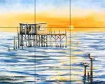
In this painting, the tree is left of center and the water-line is below the center.
A subject right in the center is like dividing the painting in half.
When the viewer looks at the subject it's like diving into a hole, then it's hard for their eyes to move out to the rest of the painting.
They feel uncomfortable, don't know where to look and many times leave the painting.
How Do We Avoid the Center Lines?
The rule of thirds is the easiest rule of composition in art. The focal point is never on the center lines.
It places the focal point about one third of the way into the painting. The viewer's eye then has space to move around and look at the other parts of the painting.
How Do We Use the Rule of Thirds?
Divide the painting surface into thirds.
 Using the Rule of Thirds
Draw two lines up and down and two lines across the painting surface.
This makes nine equal spaces. This works whether our painting is oriented either horizontal or vertical.
Place the focal point at one of the intersections.
We may use any intersection, the left, right, top or bottom intersection.
In the example painting, the Scrub Jay is located at the top right intersection of the lines.
The viewer's eye is drawn into the painting. Then there is plenty of space for their eyes to move freely into the rest of the painting.
Are There Different Types of Compositions?
The two main types of compositions are symmetrical and asymmetrical.
What Is a Symmetrical Composition?
Symmetrical compositions are basically the same on both sides.
 Symmetrical composition
The elements on one side of the painting are like a reflection of the elements on the other side.
Repeating similar shapes and forms on each side of the painting creates a symmetrical composition.
The composition is evenly balanced and has a feeling of stability and calm.
They are very good for painting a formal building where the left and right side look similar.
Balance is an important principle of art.
What Makes an Asymmetrical Composition?
Asymmetrical paintings have different elements on each side.
 Asymmetrical painting
Even though each side has different elements, they visually feel the same weight.
For example: A single large object can be balanced by several small objects on the other side.
Many modern compositions are asymmetrical. They feel dynamic.
They create interest and encourage the viewer's eye to move around the entire painting.
Unusual Compositions
 A circle composition of koi.
Circle compositions are not common.
They may be symmetrical or asymmetrical depending on how the artists portrays the scene.
 A variation of a circle composition.
Here I had fun painting more koi in a double circle.
That's the joy of painting, the opportunity to express ourself.
Who Likes Boring Compositions?
Variety is so important in our paintings! Repetition is boring.
 Variety Is the spice of painting.
Have a variety of sizes, shapes and colors to keep the painting interesting.
For example:
- Use large, small and medium items throughout the painting, never all the same size.
- The turtle occupies a medium amount of space. The water takes up the most area. Other items take up small spaces.
- Consider color: Use different amounts of warm and cool colors. The warm yellow and oranges contrast with the larger amount of cool blue.
How Do We Use Lines and Shapes?
After we position the main subject, we are well on our way to an exciting painting.
But there are a few other things to keep in mind to avoid pitfalls.
- Lines leading the viewer into the composition are desired.
- There can be some lines that create problems.
- Geometric shapes may not be desirable.
Leading Lines Are Good!
Our paintings are basically made up of shapes and lines.
The lines may be actual lines or implied lines; they both are considered part of our compositions.
 Leading lines make an entrance to artwork.
The line of a road, a river or a fence may be used to lead the viewer into the landscape painting.
Still life paintings may use a stem, the table cloth, etc.
 Lines can carry emotions.
Horizontal lines are calming and peaceful.
Diagonal lines, even if they are implied, denote movement and dynamic energy.
Avoid Problem Lines
Parallel lines close to the edge of the canvas pull the viewer's eye away from the focal point and often out of the painting.
- For example, a tree trunk close to and parallel with the side of the canvas would not be a good composition in art.
- In the painting below, the lighthouse is well away from the side of the canvas. It tilts slightly toward the center of the painting to keep it from being parallel with the edge of the canvas.
 Lines are important in composition.
Lines going directly out the painting will lead the viewer's eye right out of the painting.
- This is especially true of lines going out the corners of the painting.
- The top of the lighthouse is subdued to keep the viewer's eye in the painting, instead of directing it out.
- The right side of the horizon line has the value contrast lessened and the edges softened to keep the viewers' eyes inside the painting.
A good composition will break a long horizon line.
Use a bird, a tree, a mountain or something to break the horizon line. A long, straight horizon with no break gives the viewer a highway to travel right out of the painting. We want to keep the viewers inside the painting.
The horizon line of landscape paintings should be placed above or below the center line. That's using good composition.
Geometric Shapes
Geometric shapes are static and non-artistic.
Shy away from using definite geometric shapes like a square, circle or triangle.
Use your artistic license to change geometric shapes. We don't have to paint things exactly like they are in real life.
For example, we may have:
- A rectangular building: Move the view of the building to change its shape or camouflage it with foliage or shadows, etc.
- A mountain shaped like a triangle: Put whoop-de-dos in the mountain to change its shape.
- A lake that is a circle: Meander the shoreline, so it's not a perfect circle.
What's the Best Way to Position Items?
Here are some ideas to help us place the items in a painting.
- How do we position people or animals in our artwork?
- Is it best to group items or have singular items?
- What are tangents and how can we handle them?
Positioning People or Animals
 The hummingbird is facing in.
How we position people or animals is important for artists.
Position them facing into the painting.
The viewer's eyes will follow the line of vision of a person or animal.
The hummingbird is looking at the flower thinking about lunch.
That keeps the viewer's eyes inside the painting.
If a critter or person is looking out the side of the painting, their line-of-sight will carry the viewer's eyes right out of the painting.
That's not what painting compositions are supposed to do.
Grouping Items vs Single Items
Things look better in groups or near other items.
 A group of five daisies.
A group of items feels more comfortable to the viewers.
Odd numbers keep our paintings interesting and keep the viewers looking longer.
Numbers such as three, five or seven are more pleasing than even numbers.
Even numbers like two, four or six are stagnant and unexciting to the eye.
So, no matter if its trees, rocks or apples, use odd numbers for creating good compositions.
Single items attract attention.
Single or solitary items are great for the focal point. But in other areas of the painting group the items together.
What Is a Tangent?
A tangent is where two items are just barely touching each other. Artists call this "kissing". Tangents make the viewers feel uneasy.
Position items so they aren't barely touching each other or the edge of the canvas.
 Move or overlap tangent items.
Suppose we have a reference image with two roses barely touching each other, like #1 in the photo? What do we do?
- We may move the touching roses farther apart, so they no longer touch.
- Or we could move one rose forward, so it overlaps the one behind.
#2 shows the open rose overlapping the bud behind it.
Overlapping items is a great way to create distance in a painting. There are more ways to create distance in a painting.
Review the Composition of This Painting
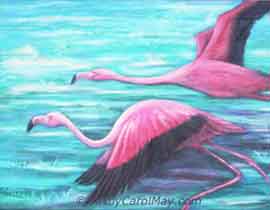
Let's review what we have learned using the painting from the top of the page.
 Does this painting have good composition?
How does this asymmetrical painting stand the test?
- The subjects are not on the (red) center lines. They are on the (black) third lines, that keeps the painting in balance.
- The lily petals and dragonfly act as leading lines into the painting.
- The round lily pad was changed into an artistic elliptical shape.
- There are no kissing tangents.
- The dragonfly is positioned looking into the painting.
- There is a variety of sizes and different amounts of warm and cool colors.
- The diagonal line from the dragonfly to the center of the flower implies movement.
A good composition doesn't have to be perfect, just look for big mistakes.
Another important aspect of composition - is to include good value contrast.
After a few paintings, you will be able to design good compositions instinctively without using a checklist.
Trust Your Instincts
The rules of thirds and center lines are important guidelines for painting art.
BUT - We don't always have to follow the rules for successful paintings.
We have an artistic license to move and change things in our paintings.
When it feels right to us, it will please the viewers. That's what good composition in art is all about.
More About Painting Good Art
Rule of Thirds: Creates Easy Compositions
Artists use the rule of thirds to create dynamic compositions. It's our shortcut for easy composition that creates balanced paintings that attract the viewers.
How to Paint Good Art: Fundamentals Create Awesome Art
How to Paint Good Art starts with the fundamentals of art. Understand composition, focal point, color and values to create stronger, more engaging paintings.
Focal Point in Art: Create Artwork to Attract Viewers
You can create a focal point in art. A complete guide of proven techniques using contrast, color and composition for attractive artwork that engages the viewers.
Values in Painting: Create Strong Artwork
Every artist needs to know how to use values in painting. Color is fun, but using values, light and dark colors is what creates strong attractive paintings.

Recent Articles
-
Fix Common Mistakes
May 01, 26 01:00 PM
 Every artist encounters common painting mistakes. There are times when a painting just does not seem to work. Most often it's a design issue. The problems come back to composition, focal point, and va…
 -
Find Your Art Style
Apr 24, 26 01:00 PM
 Finding your style isn’t about picking a label or copying someone else. It’s about noticing what you’re drawn to - and repeating a few things long enough that your choices become consistent. Go from l…
 -
Create Your Own Art!
Apr 14, 26 01:16 PM
 If you have been following the step-by-step lessons and you are ready for the next step. Begin creating your own paintings with confidence. Learn how to plan a painting, solve common painting problems…