- Home
- Painting Fundamentals
Can I Learn How to Paint Good Art?
You certainly can, learning how to paint good art usually comes down to mastering the fundamentals of art.
On this page, we’ll walk through the core fundamentals of art - composition, focal point, color, and values with my 3-point checklist for assessing paintings.
Brand new to painting? Start with the Beginner’s Guide: Learn How to Paint Art, then come back here to refine your fundamentals.
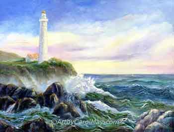 You can paint good art!
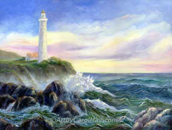 You can paint good art!
How to Paint Good Art
During planning and painting, I check my artwork for the Big Three:
- An inviting composition (including a focal point).
- Good use of color.
- Contrasting values.
When you improve even one fundamental, you’ll see a difference in your paintings.
Create an Inviting Composition with a Focal Point
Good art attracts people and draws them in for a deeper look at your painting.
Focus on clear shapes with a variety of sizes, so the eye moves naturally through the painting. Use three main areas; large, medium, and small.
Our compositions becomes even stronger when you understand the principles of art and how they guide the use of shapes, movement, balance, and emphasis.
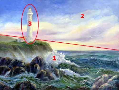 Each area of the composition is a different size.
Paint the composition with three parts.
- One part of the painting will cover a large area. The land and ocean are the largest part in this painting.
- The sky without the lighthouse, takes up less space.
- The lighthouse (the focal point in this painting) covers the smallest area.
We are looking for a variety of sizes to keep the viewers interested.
Once you start seeing your paintings as arrangements of big parts/shapes, you’ll notice opportunities to make small changes that have a big impact.
The next step is deciding where you want people to look first.
What's a Focal Point and How Do We Make a Strong One?
The first thing we want people to notice in our paintings is the focal point.
 Include a focal point.
Strong paintings rarely give equal attention to everything. Instead, they gently insist - Look at the focal point first, then explore the rest.
We make a strong focal point by:
- Contrasting values and/or colors.
- Use the rule of thirds or off‑centered composition to position the subject.
- Provide leading lines or shapes pointing toward the subject.
- Reduce the competing details, so the focal area stands out.
Find out more about how to create a focal point in your artwork.
Glorious Color!
Color is often what first attracts people to a painting, and it’s usually what we artists fall in love with. Where would we be without color.
Think in threes. - Use three colors in 3 different amounts.
If you want a simple way to choose and organize your colors, the artist color wheel makes color theory much easier to understand and use in painting.
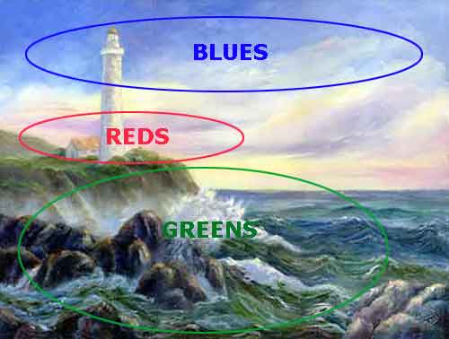 Each color covers a different sized area.
- In this painting red is used in a small amount in the clouds.
- Blue takes up the medium space in the sky and parts of the water.
- The greens in the land and much of the water take up the largest area.
Painting each color in different amounts keeps the painting interesting.
Variety is the key to painting good art. Learn how to mix colors.
Using Values in Artwork
Values are the relative light and dark that create form and depth.
Paint at least three value groups; light, middle, and dark. Each covers a different sized area to avoid a flat result.
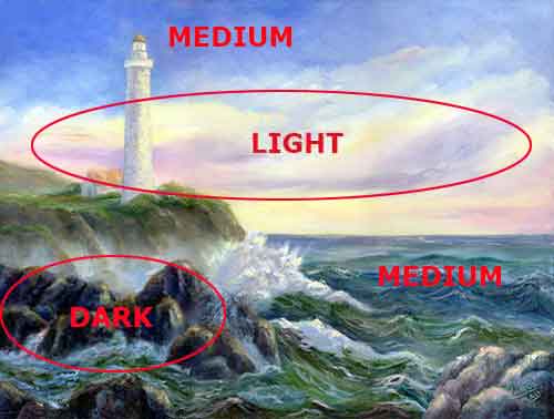 Paint the values different sizes.
- Medium values - the land, ocean and the blue sky fill the largest amount of area.
- The lightest value - lighthouse, clouds, and ocean spray cover a medium area.
- The dark value rocks cover the smallest space.
Think three values - in 3 sizes.
There will be other in-between values taking up small amounts of space.
More Examples with Quick Exercises
Let's look at some additional examples with a few exercises.
Composition
Composition makes the painting feel balanced and invites the viewers in.
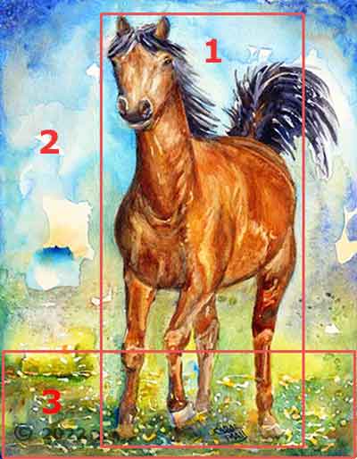 Variety is interesting.
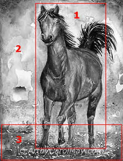
Once again, this painting has three main areas, each a different size.
- The horse covers the largest area.
- The background is middle-sized.
- The foreground is the smallest space.
Should we center the subject?
Notice the horse is not exactly in the center. He has more space in front of him than behind.
We rarely put the subject dead-center in the middle of the painting.
Quick Start: Composition (10-15 minutes)
- Choose an item you see now, your cat, chair, flower vase, etc.
- Sketch three thumbnail layouts and choose the strongest.
- Note: It doesn't matter which part of the sketch is what size. The subject could be the smallest area or the background, etc.
Try rotating one thumbnail 90° and see if the balance improves or not. Which way looks better?
More Color
Instead of another color example - Let's look at another aspect of color.
How can we avoid mixing muddy colors?
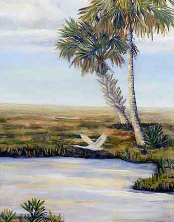 Mix natural looking colors.
There are a couple of reasons our mixed colors may turn out dull looking.
- Using more than two colors in the mixture. We get cleaner colors by mixing only two colors.
- Not using single pigment colors. If a color contains two pigments and we mix it with a third color, that's three colors in one mix. That often makes mud.
How do we mix natural looking colors?
Mix together a cool and warm color. The mixtures are more life-like, instead of artificial looking colors.
Identify common warm or cool color bias for mixing clean colors.
Quick Start - Natural looking greens: (10 minutes)
- Mix a single realistic green from two pigments to feel color bias.
- Mix Lemon Yellow (cool) with Ultramarine Blue (warm).
- Mix Lemon Yellow (cool) with Phthalo Blue GS* (cool).
Which mixture is a bright, vivid green? Which green looks more realistic?
*Phthalo Blue RS (red shade) is a warm color.
More About Values
Once again, we paint the 3 values in three different amounts.
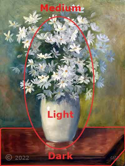 Variety is interesting.
- The flowers and vase are the largest and lightest.
- The background is a middle-sized, medium value.
- The table is the smallest and the darkest value.
Values can create distance.
Values look lighter and colors appear cooler in the distance in the distance because the particles in the air block our view.
In this painting: The background is cooler than the flowers, that pushes it into the distance.
A good contrast between light and dark values is so important! How to use values to paint good art.
Quick Start - Value study: (10 minutes)
- Choose a simple object lit by a lamp or window (to create shadows).
- On a small scrap of paper, block in only 3 values: light, middle, dark.
- Don’t draw details, just big shapes of light and shadow.
Step back and look: does the object feel 3D and clear, even without color?
Even small improvements in values can improve our paintings. When we combine stronger values with thoughtful composition and color choices, everything starts to work together.
Summary: How to Paint Good Art
We've seen the big three fundamentals individually, let's bring them together.
- Composition: Paint each of the 3 parts of a painting in a variety in sizes.
- Color: Use 3 colors in different amounts (mix any additional colors).
- Values: We want 3 main values, (light, medium, and dark) each covering a different amount of space.
You Can Create Good Art with The Big Three!
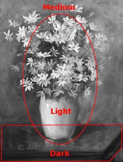
See how values, color, and composition complement each other and work together in the grayscale of the two paintings below.
The values were created with 3 colors in a 3-part composition.
This composition was created using 3 main values and 3 colors.
Continued Learning
Want to learn more: Try one small exercise for each fundamental.
You don’t need to master everything at once. Just practice in small, focused sessions. They will start to change how you see things in your own paintings.
3-Day Better Painting Sprint (5-15 minutes)
- Day 1: Composition
- Day 2: Value study
- Day 3: Natural looking greens
These are not meant to be finished art. They’re just for practice. Make it fun and put them in a small sketchbook marked 'Practice'.
We all have an innate knowing of what looks good. Tune in and listen to your inner artist voice and start painting ---
 Every artist encounters common painting mistakes. There are times when a painting just does not seem to work. Most often it's a design issue. The problems come back to composition, focal point, and va…
 Finding your style isn’t about picking a label or copying someone else. It’s about noticing what you’re drawn to - and repeating a few things long enough that your choices become consistent. Go from l…
 If you have been following the step-by-step lessons and you are ready for the next step. Begin creating your own paintings with confidence. Learn how to plan a painting, solve common painting problems…