- Home
- Color Schemes
Create Harmony with Color Schemes in Art
Have you thought about using color schemes in art?
Artists select colors to establish color balance and mood in their paintings. Color makes our artwork more engaging and meaningful to the audience.
How do we know what colors will look good together? That's a good question.
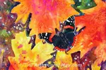
 Create harmonious paintings.
As a beginning artist, I just used the colors suggested by the instructor.
Then when I started doing my own original paintings, I couldn't figure out what colors to use.
Have you ever been in that dilemma?
There are so many beautiful colors to choose from. How do we choose colors that will look good together in a painting?
What's the answer?
Start using a color scheme of only one to five colors. Mix any additional colors from the selected scheme.
The viewers will engage and enjoy the pleasing harmony in your paintings.
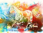
Color Schemes in Art
Artists today use color schemes because they work. We will look at some popular color schemes.
First you may be curious about a few things.
What Are Color Schemes in Art?
What Are Color Schemes in Art?
A color scheme is a selection of colors chosen to create harmony and balance in our paintings.
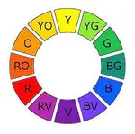
The color wheel is the tool artist use to select colors. It helps us choose our colors based on their relationships with other colors.
Why is a color scheme important for painting art?
By carefully selecting colors, artists can guide the viewer's eye, highlight focal points, and convey specific themes.
Can Color Schemes Affect the Mood of Artwork?
Can Color Schemes Affect the Mood of Artwork?
Yes, colors definitely have an influence the viewer's response.
Warm colors can be exciting and energetic. Cool colors are more likely to portray peace and tranquility.
A monochromatic color scheme can create unity and focus. On the other hand, a complementary color scheme is more dramatic.
How Do the Color Schemes Work?
How Do the Color Schemes Work?
Here are several common color schemes in art. They each have unique effects.
Monochromatic is variations of one color that creates unity, emphasizing form and texture.
Analogous colors are next to each other on the color wheel, for instance red-violet, red and red-orange. It creates a very harmonious look.
A complementary color scheme is a pair of colors opposite each other on the color wheel like blue and orange. It displays high contrast and creates visual excitement.
The triad scheme is three evenly spaced colors on the color wheel, such as red, yellow, and blue. It is a balanced palette with contrast, but always in complete harmony.
How Do We Choose a Color Scheme?
How Do We Choose a Color Scheme?
Consider several things while choosing a color scheme.
- The mood of the painting: What emotional tone do you want the painting to express?
- The subject: What colors naturally complement or portray the subject?
- Our personal style and preferences
The color wheel helps us look at potential schemes, such as complementary, analogous, or triadic.
Preliminary color sketches help us visualize how different schemes would look in a proposed painting.
Finally, trust your art heart. Select what looks good to you.
Popular Color Schemes in Art
Let's look at common color schemes with examples of how they are used in paintings.
The color wheel images many times include yellow to make the examples more consistent.
Any of the color schemes may be turned around to include different combinations from the twelve colors of the color wheel.
Monochromatic Color Scheme
Monochromatic is the simplest color scheme. The name is self-explanatory. It is only one color from anywhere on the color wheel.

The monochromatic scheme creates a cohesive and calming effect, emphasizing form and texture.
A single color may be used to portray various emotions, such as red for love or blue for sadness.
The chosen color may be modified by adding a neutral dark to create different shades of the original color.
We may also add white to create various tints.
This orangutan is basically orange. It's the closest thing I have in have to a monochromatic painting.
It was painted with Quinacridone Sienna. It was mixed with its complementary blue to make the black and neutral shades.
Doing a monochromatic painting is an excellent way to learn how to use values in our paintings.
Complementary Color Scheme
The complementary scheme is very popular, probably the most used color scheme.
It uses any two colors that are directly across the color wheel from each other.
Complementary colors are often used in advertisements to attract customers. It works the same in a painting. Two complements attract attention and draw the viewers to the painting.

Two complements provide a high-energy contrast and harmony at the same time.
In order to not overwhelm the viewer, an artist would use more of one complement and less of the second one.
The second complement would be used for highlights or for the focal area.

This painting used yellow-green with its complement red-violet.
They were mixed to create the darker green leaves and the various muted colors for the background.
The mixed neutral color was softened with white for the colors in the roses.
Split Complement Color Scheme
The split complement scheme uses the colors beside the direct complementary color.
This color scheme is less intense than the complementary scheme.

Artists often use the base color in largest area of the painting.
The other two colors on each side of the direct complement are used for highlights, accents and mixing.
The example painting of the bluebird bathing used blue as the dominant color. The yellow and red-orange were used for smaller areas of the painting.

This fun painting came from the Bluebirds bathing in our backyard.
It was painted with Burnt Sienna, New Gamboge and Ultramarine Blue.
Blue and orange made the darks on the feathers, his beak and eye.
Yellow was used for the highlights on his chest with a little in the water.
Double Complement Color Scheme
The double complement scheme uses two sets of complementary colors.
This is one of the most popular color schemes in art that provides both contrast and color harmony.

A double complementary scheme adds more variety to the painting.
It provides a wider range of color mixing possibilities, while still maintaining harmony.
Compare this scheme to the complementary scheme above.
The addition of yellow and violet makes bold a statement and adds some lovely nuances to the painting.

Here I used the same two complements as the rose painting.
But for more variety, I added a color next to each complement giving me the double complementary color scheme.
Adding yellow gave me some brighter colors for the highlights.
The addition of purple, violet gave more depth to the darks.
Analogous Colors
The analogous color scheme is usually made of three or more adjoining colors anywhere on the color wheel.
Using the neighboring colors makes a painting that feel unified and soothing. It gives a sense of flow to the painting.

The harmony of analogous colors moves the eye smoothly throughout the painting.
The set of colors may be warm or cool or a combination. They may be used to create a mood or atmosphere.
They may create a rich unified palette and at the same time simplify our color decisions.

This sea shell painting was done from actual shells. Their natural colors are in perfect harmony.
Burnt Sienna was used for the orange with Permanent Rose for the red.
Permanent Rose is the closest red to primary red.
A Triad of Colors
The triadic color scheme uses three colors spaced equally around the color wheel.
A triad scheme of colors always creates a balanced painting.

This scheme is known for its boldness and at the same time being harmonious.
The most common set of triads are the primary colors, red, yellow and blue.
Normally one color would be dominant with the other two colors playing a supporting role.

This painting used the primary colors red, blue and yellow.
We can of course turn the color scheme around to any other three colors on the color wheel.
The greens and dark colors were easy to mix from the primary colors.
Semi-triad Color Scheme
A semi-triad color scheme comes from one half of the color wheel, in any direction.
The semi-triadic scheme keeps the wonderful interactions of the triad scheme, but provides more flexibility and creativity.

A semi-triad scheme includes three equidistant colors on half of the color wheel.
The two colors directly across from each other are always complements.
Complementary colors are excellent for mixing the dark and neutral colors.

Permanent Rose and blue-violet, Ultramarine were excellent colors for painting the azaleas.
If we use single pigment colors, they are good for mixing more clean, clear colors.
Complement + 1/2 Right
The complement plus one half right is a more nuanced color scheme. It allows the artist to explore subtle variations and contrasts.
This color scheme is ideal for complex compositions that require a delicate balance of color and harmony.

Complementary colors are any two colors directly across from each other.
To get a complement + one half right color scheme, move two spaces to the right of either complementary color.
The third color adds more interest to the painting. And it provides greater variation in the mixed colors.

This color scheme is very similar to the scheme in the wren painting below.
Here I used the complements blue for the vase and orange for the flowers.
The one half right color was yellow that was used to mix the green leaves. A bit of orange added to the mixture to subdue the greens.
Complement + 1/2 Left
The complement plus one half left color scheme is the same as the above, except we move left two spaces from either complement.

My favorite painting color schemes are the Complement + 1/2 left and Complement + 1/2 right.
These two color schemes allow the artists to experiment and push the boundaries of traditional color use.
The other scheme I often use is the Split Complement scheme.

Orange and blue were mixed to create the browns in the wren.
The yellow and blue made a variation of greens for the leaves and background.
White lightened some of the greens and orange subdued them.
Color Schemes in Art Create Perfect Harmony
These have been my go-to painting color schemes for about thirty years and I am happy to share.

Why did I start using color schemes in art?
When it came to selecting colors for a painting
I was in a dilemma.
The solution was a three-step plan that got me ready to use a color scheme for each of my paintings.
You can select your color schemes with the same process.
See how to choose colors for a painting. The turtle painting is shown as an example.
More About Color
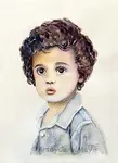
Mix Skin Color for Your Portrait Paintings
You can paint portraits when you know how to mix skin color. Make the skin colors and paint a child’s portrait with a step-by-step watercolor painting guide.
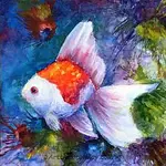
Painting with a Limited Palette: Master Color Harmony
Discover the art of painting with a limited palette. Tune in to color harmony & craft a fun, colorful, harmonious step-by-step painting with only four colors.
Choose Colors for a Painting: Select Harmonious Colors
How do we choose colors for a painting? You can create beautiful, harmonious paintings. How do professionals create beautiful paintings with only 3 or 4 colors?
Artist Color Wheel: Using Color Theory for Beautiful Paintings
Learn color theory with the artist color wheel. Understand primary, secondary, complementary colors, how to use colors and the perfect color wheel for your art.

Recent Articles
-
Paint a Beach Tutorial
Jan 16, 26 06:58 PM
 Create stunning beach art with this step-by-step tutorial. A comprehensive guide on how to paint a beach. It only takes five colors to paint this seascape. Learn the steps of painting the easy backgro…
 -
Learn How to Paint
Jan 02, 26 02:00 PM
 Are you new and want to learn how to paint art? On this page, you’ll find ideas of what to paint, the supplies we really need, the fundamentals of good art (values, color, composition), and beginner-f…
 -
How to Oil Paint
Dec 19, 25 02:00 PM
 Are you eager to learn how to oil paint? What are the essential supplies for oil painting? What do we need for clean-up and how long do oil paintings take to dry? Learn the rules of oil painting and t…
Recent Articles
-
Paint a Beach Tutorial
Jan 16, 26 06:58 PM
Create stunning beach art with this step-by-step tutorial. A comprehensive guide on how to paint a beach. It only takes five colors to paint this seascape. Learn the steps of painting the easy backgro… -
Learn How to Paint
Jan 02, 26 02:00 PM
Are you new and want to learn how to paint art? On this page, you’ll find ideas of what to paint, the supplies we really need, the fundamentals of good art (values, color, composition), and beginner-f… -
How to Oil Paint
Dec 19, 25 02:00 PM
Are you eager to learn how to oil paint? What are the essential supplies for oil painting? What do we need for clean-up and how long do oil paintings take to dry? Learn the rules of oil painting and t…