- Home
- Limited Palette Painting
The Artist's Secret to Color Harmony: Painting with a Limited Palette
Why should we be painting with a limited palette?
There are so many gorgeous paint colors available. Why not just squeeze the colors out of a tube instead of mixing them?
Fewer colors open a world of harmony and ironically, a variety of color like never before.
That's the reason many professional
artists use a limited palette. Their paintings always display perfect color harmony and cohesiveness.
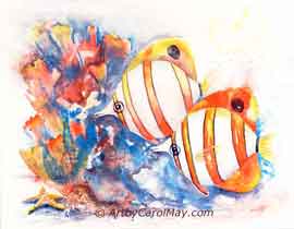
 "Fun Fish" from a limited palette
 "Fun Fish" from a limited palette
Why Do Artists Use a Limited Palette?
Harmony: A limited palette automatically creates a harmonious painting. All the colors are related and that gives the painting cohesiveness.
Even if the shades or tints are contrasting, they still share some common characteristics. They are derived from the same few colors which creates a unified look.
Values and Tones: A limited palette forces us to focus more on the values of colors. This constraint helps improve our skills in depicting light, shadow and forms.
Creativity: Painting art with a limited palette enhances our creativity. It pushes us to make the most of the colors we have.
It can even help spark new techniques and ideas that wouldn't have occurred in a wider palette.
History of Painting with a Limited Palette
In centuries past many artists were known for using a limited palette. It may have been out of necessity because they ground the pigments to make their own paints.
Great artists of the past, like Leonardo da Vinci and Rembrandt often used a limited palette to create their masterpieces.
Old masters during the renaissance used a four-color palette; yellow, red, blue and green.
The Zorn Palette
Anders Zorn from the late 1800s is well known for painting with a limited palette; yellow ochre, vermilion, ivory
black and white.
Ivory
black contains blue. So, when it's mixed with yellow ochre it makes muted greens. Most of his paintings were indoor scenes, so he
had no need for landscape greens.
Monet's Palette
Many times, Monet used a limited palette. He was noted for doing his paintings outside on location. So, he used a brighter green to enhance his paintings.
His palette was flake white, cadmium yellow, vermilion, deep madder, cobalt blue and emerald green for many of his landscape paintings.
Less Is More
Modern artists have continued the
tradition of using a restricted color palette. It
doesn't depend on how many colors we use, but how we use them.
Budding artists find a limited palette an excellent way to learn about mixing colors.
It's practical, too. We only have to stock a few colors. When we attend workshops or paint on location, we don't have to carry many tubes of paint.
How Many Colors Do We Need?
A limited palette does not mean boring! It does not mean our paintings will have only a few colors.
We get many additional colors by mixing. The colors will always harmonize and give us a cohesive color scheme because they are based on just a few original colors.
It's easy to learn how to mix colors.
The Primary Limited Palette
Choosing the right colors for your palette is personal. It depends on what we like, the subject and what effect we want to paint.
A good way to start a limited palette is with
some version of the primary colors.
- Cadmium Yellow Light
- Cadmium Red
- Ultramarine Blue
This palette with the addition of white will give us a wide range of mixed colors.
- It is easy to mix orange from yellow and red. Use white or blue to vary the oranges.
- Ultramarine Blue and Cadmium Yellow Light make some lovely greens. Adding red or a mixed orange to the greens creates a wider variation.
- Red and blue mix to make violet. However, the violet from Ultramarine Blue and Cadmium Red is a bit muddy, not a real clean color.
There is a simple solution, double the primary palette.
Some artists swear by the power of a
three-color palette, others prefer to have six to eight
colors.
Double Primary Palette
A double primary palette is also called a split-primary palette. Each primary color has a warm and cool variation to mimic the way natural light affects color.
- Cadmium Yellow Light and Cadmium Yellow Medium
- Cadmium Red Light and Alizarin Crimson
- Ultramarine Blue
and Phthalocyanine Blue GS (Phthalo Blue)
This is still only six tubes of paint. Mixing the colors and the addition of white will give the artist all the colors ever wanted or needed.
We can get nice violet colors by mixing Alizarin Crimson with either of the blue colors.
Phthalo Blue mixed with either yellow gives us some nice bright greens.
Experimenting: Every artist should spend time painting with limited colors. It gives us a deeper understanding of color, as we develop our personal preferences and a unique style.
Fun Tutorial of Painting with a Limited Palette
Let's do a fun, colorful fish painting with a limited palette. We use:
- 8x8 canvas and a #10 round brush
- Cadmium Yellow Light
- Cadmium Red
- Permanent Alizarin Crimson
- Thalo Blue
- Titanium White
Find the basics of oil painting here.
Underpaint the Background
Casually lay in the background using all of the palette colors, except white.
 Underpaint the background
Thin the colors with solvent, so they will dry fast. Don't do any blending on the canvas.
In about an hour, we will soften and blend them. If they are blended now, it will make mud.
When you are painting with a limited palette, you don't have to be concerned about which colors to use. Any and all of the colors will harmonize and work well with each other.
Start Painting the Body of the Fish
Paint the orange part of the fish with Cadmium Red and Cadmium Yellow mixed for an orange.
On the bottom part away from the light, blend in the darker, cooler Permanent Alizarin Crimson.
 Paint the orange spot
Please note, cadmium colors are associated with a health hazard. I use Winsor Newton colors and their Winsor reds and yellows are made without the use of cadmium.
 Continue painting the red areas
Add more yellow to the red on the top of the fish where the light is hitting.
Carry some of the red color out into the fins.
Use the cool Alizarin Crimson or a mixed red and blue where the fins attach to the body.
Shadow the Body
Paint the shadow areas of the fish with blue that has been softened a bit with red.
 Underpaint the shadow areas
It is difficult to paint dark oil colors into white. So, we paint the dark shadow color first before we add white.
Finish the Body, Including the Eye
Paint the dark eye with a combination of mixed red and blue. More blue makes it darker.
Paint a red ring around the eye. Add blue to shadow one side the eye ring.
 Paint the white parts of the goldfish
Now paint the white areas of the body. Gently blend the white into the shadow paint.
Mix some yellow and white for the top edge of the head.
Blend the Background Colors
The background colors have dried a bit, but we need to blend them before they are completely dry.
Pull a soft, dry brush gently over the background colors to blend them. The blending was done with about a 1/2" flat brush.
 Blend the background colors
After the background is blended, we can pull the fin colors out over the background.
Since this is a small canvas, I like to pick it up and turn it when I am painting. So, I left one corner unpainted to keep my hands clean. It will be painted in later.
Paint the Fins
Using white, paint the fin colors out into the background.
It is your option; you may want to add a bit of yellow or blue to the white.
 Paint the fins
Blend the white into the red of the fins.
Oops, I had forgotten to make the fins darker where they attach to body. So, I added a bit of blue. (Next image) Either blue or alizarin crimson would be fine to darken the fins where they attach to the body.
Have Some Fun on the Background
The thinly painted background is fairly dry now. So here comes some fun!
 Have some fun!
Dab on some contrasting colors that are thinned down with solvent, like odorless mineral spirits.
Then using a soda straw, blow the thin colors to make them look like sea grasses.
Lots of fun!
Since we are painting with a limited palette, any of our colors will harmonize well with the painting.
Detail and Finish the Painting
Paint a light highlight on the eye with a tiny touch.
 Finish the details
Pull a clean, dry brush along the outer edges of the fins to soften them into the surrounding water.
Finish the background around the goldfish. Use any of the colors from your limited palette. They will all harmonize.
Painting with a limited palette allows us to express the power of simplicity, color harmony and our creativity.
Let the power of less - breathe new life into your artwork! Discover additional exciting aspects of
painting art on ArtbyCarolMay.com!
Your Canvas is Waiting!
You Might Enjoy These Pages
How to Paint a Dog: An Easy, Fun Painting on Canvas
How to paint a dog on canvas. A fun, easy dog painting in oils with professional techniques for oil painting in a step-by-step tutorial that uses only 3 colors.
Oil Painting Supplies at Art by Carol May
All about oil painting supplies, what do we need to do an oil painting, best paints, brushes, colors, what to paint on, what are alkyd paints, clean up and more
How to Oil Paint: Rules and techniques of oil painting
Are you eager to learn how to oil paint? Paint a lovable Teddy Bear with a step-by-step painting tutorial using the rules and techniques of oil painting.
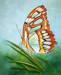
How to Paint a Butterfly in Oils: Malachite Tutorial
Learn how to paint a butterfly in oils with this step-by-step Malachite tutorial for beginner and intermediate artists by artist Carol May


Recent Articles
-
Fix Common Mistakes
May 01, 26 01:00 PM
 Every artist encounters common painting mistakes. There are times when a painting just does not seem to work. Most often it's a design issue. The problems come back to composition, focal point, and va…
 -
Find Your Art Style
Apr 24, 26 01:00 PM
 Finding your style isn’t about picking a label or copying someone else. It’s about noticing what you’re drawn to - and repeating a few things long enough that your choices become consistent. Go from l…
 -
Create Your Own Art!
Apr 14, 26 01:16 PM
 If you have been following the step-by-step lessons and you are ready for the next step. Begin creating your own paintings with confidence. Learn how to plan a painting, solve common painting problems…