- Home
- Painting Fundamentals
Use the Painting Fundamentals to Create Great Artwork
Painting fundamentals are the essential building blocks for creating artwork that reads clearly and resonates with viewers.
This page introduces the core fundamentals; composition in art, focal point in art, values in painting, and color.
Quick Start - Pick one fundamental to practice right now. (5–15 minutes)
- Composition studies: sketch three thumbnail layouts and choose the strongest.
- One color mixture: mix a single realistic green from two pigments to feel color bias and harmony.
- Do a value study: block in light, mid and dark areas to see how contrast affects depth and focus.
 You can paint good art!
 You can paint good art!
The Big Three Painting Fundamentals
A captivating painting often has an emotional impact that subconsciously captures the imagination with the beauty or message of the painting.
On the technical side: The artist uses good composition to guide the viewer.
A full range of light and dark values to spark contrast. Good color choices bringing unity and harmony to the artwork.
Let's see how to captivate and delight the viewers.
How Do I Create an Inviting Composition?
Focus on clear, distinct shapes and a variety of sizes so the eye moves naturally. Use three main areas; large, medium, and small.
Avoid dead‑center placement, and provide an entrance (path, line or object) from the bottom edge to lead the viewer in. Test layouts with quick thumbnails to pick the strongest option.
This painting fundamental invites the viewers into the painting.
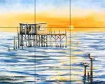
Paint the composition with three parts.
- One part of the painting will cover a large area. In this painting the land and ocean are the largest part of the painting.
- The sky without the lighthouse, takes up less space.
- The lighthouse is the focal point in this painting. It covers the smallest area.
 Each area is a different size.
Quick Start
Composition studies: Sketch three thumbnail layouts and choose the strongest.
Note: It doesn't matter which part of the painting is what size.
The subject could be the smallest area or the background, etc. It doesn't matter.
What we are looking for is a variety of sizes.
We want three different sizes to keep the viewers interested.
Here's Another Composition Example
Once again, this painting has three main areas, each a different size.
 Variety is interesting.
- The horse covers the largest area.
- The middle-sized background is smaller.
- The foreground is the smallest area.
Should we center the subject?
Notice the horse is not in the center. He has more space in front of him than behind.
We rarely put the subject dead-center in the middle of the painting. That's boring.
The rule of center lines is the most important rule for creating good compositions.
Read about the rule of center lines and other tips for creating a good composition in art.
What Is a Focal Point and How Do I Make a Strong One?
A focal point is the painting’s main subject. It's where the viewer's eye should land first.
Make it strong by using contrasting values and/or colors. Use the rule of thirds or off‑centered composition. Provide leading lines or shapes pointing toward the subject. Reduce the competing details so the focal area stands out.
 The focal point is the subject.
A good composition guides the viewers to the focal subject.
That's how we paint good art.
The viewer's eyes are automatically drawn to the lighthouse, the focal point.
Many artists use the rule of thirds, as an easy way to position their subject, the focal point in their paintings.
It automatically creates a balanced, interesting composition.
Find out the various techniques of using the rule of thirds.
Provide an Entrance to Your Painting
A
common way to invite viewers into a landscape painting is to paint a
road, a path, a stream or river running up into the painting.
 Provide an entrance to the painting.
Start the entrance at the bottom of the painting.
Make the entrance a little above or to the right of the bottom left corner, not directly out of the corner.
Still life paintings may have a tool, a flower or other objects pointing up into the painting from the bottom.
A long object directly across the bottom of the painting, such as a fence or a rock wall will make the viewer feel uncomfortable and keep them from entering the painting.
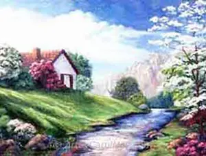
You can paint this mountain landscape with a step-by-step tutorial.
How Do I Create Color Harmony in My Paintings?
A painting color scheme of three to four colors will create a harmonious painting.
Many additional colors can be mixed from the three or four colors. The mixed colors will all harmonize because they are based on the original colors.
Think in threes again. Use the colors in different amounts.
 Each color covers a different size.
- Red is used in a small amount in the clouds.
- Blue takes up the medium amount of space in the sky and parts of the water.
- The greens in the land and much of the ocean water fill up the most space.
Again, it doesn't matter which color takes up what amount of space. Just paint each main color in different amounts.
When each color covers a different amount of space, the painting is more interesting.
How Can I Avoid Mixing Muddy Paint Colors?
Keep mixes simple: combine only two pigments at a time, prefer single‑pigment paints, and be aware of warm vs cool bias before blending.
Mix warm colors with warm, or cool colors with cool. Intermixing warm and cool colors makes mud. If a mix gets dull, start a fresh two‑pigment mix and adjust it a little at a time.
 Mix natural looking colors.
There are two or three reasons our mixed colors to turn out dull looking.
- Using more than two colors in one mixture. We get cleaner looking mixtures by mixing only two colors together.
- Use single pigment colors. If a color contains two color pigments and we mix it with a third color, that's three colors in one mix. It often makes mud.
- Mixing paints with opposing color biases. Mixing warm and cool colors together may create dull colors.
How do we mix life-like, natural looking colors?
That's when we would actually mix cool and warm colors together.
Quick Start
One color mixture: Mix a single realistic green from two pigments to feel color bias and harmony.
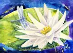
For example, mix Lemon Yellow (cool) with Ultramarine Blue (warm) to get realistic greens like in the Egret painting.
There's a whole page about using color bias for mixing clean, clear colors.
Artists Use Color to Paint Emotions
Colors convey emotions and can symbolize different things.
 Colors can bring joy.
Why do some colors make you feel calm, while others may jazz you up?
Colors carry emotions that artists use to make our artwork speak to the viewers.
Yellow and orange are happy, energetic colors.
The color of a blue sky is calm, restful and peaceful.
Colors can have multiple meanings.
Red is often considered a romantic color, but on the other hand it also means anger.
Nature paintings are filled with green, but green may also portray envy.
What is the meaning of colors and how can we use them in our paintings?
What Are Values and Why Do They Matter in Painting?
Values are the relative lights and darks that create form and depth. Paint at least three value groups; light, mid, and dark. Each covering different sized areas to avoid a flat result.
Strong value contrast defines shapes, establishes distance, and makes the focal point read clearly even from a distance.
Quick Start
Do a value study: Block in light, mid and dark areas to see how contrast affects depth and focus.
 Paint the values different sizes.
- One value will cover the largest area. The land, ocean and the blue sky are all medium values.
- Another value would cover the light part of the painting.
The lighthouse, clouds and the ocean spray are the lightest values.
- The third value covers the least space.
The rocks on the left are the darkest values.
Think three values - in 3 different sizes.
It doesn't matter which value takes up how much space of the painting. The point is to have three values and make each value a different size.
There will be other in-between values taking up less space.
Another Example of Using Values in Paintings
Paint light, dark and middle values.
 Variety is interesting.
- In this painting the light flowers and vase are the largest and the lightest.
- The background is medium values and middle sized.
- The table is the smallest and the darkest value.
A good contrast between light and dark values is very important for good artwork.
How do we create distance in our artwork?
Values look lighter in the distance because of particles in the air that block our view.
Colors also appear cooler, farther in the distance.
Quick Start
Do a value study: Block in light, mid and dark areas to see how contrast affects depth and focus.
How to Avoid Common Mistakes with Values
Values are the painting fundamental that can make or break a painting.
 Use values to create good artwork.
An artist may use a wide array of colors, but their paintings still look dull and unappealing.
What's the problem?
Poor paintings are basically all the same boring middle values.
Most paintings normally have a lot of medium values. That's okay.
But, don't ignore the light and dark values.
Contrasting values make impactful paintings.
How to Paint Award-winning Art
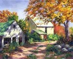
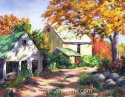
This landscape painting "Country Barns" has won two best of show awards.
 Paint with the principles of art.
It was painted using the big three painting fundamentals of a composition with a specific focal point, color, and values.
Color and values are both important elements of art.
They are a big part of this painting along with the composition.
See the details of how I used the principles of art to paint the fundamentals.
Frequent Questions
How Do I Create an Inviting Composition?
How Do I Create an Inviting Composition?
Create an inviting composition by arranging three areas of different sizes, positioning the focal subject off‑center, and using a visual entrance, a path or line to lead the viewer’s eye.
What Is a Focal Point and How Do I Paint a Good One?
What Is a Focal Point and How Do I Paint a Good One?
A focal point is the main subject that attracts the viewer’s eye; strengthen it with value or color contrast, off‑center placement, and compositional lines that direct attention.
What Are Values and Why Do They Matter?
What Are Values and Why Do They Matter?
Values are the light, mid, and dark tones that define volume and depth; using distinct value groups and contrasts prevents flatness and improves readability.
How Do I Create Color Harmony in My Paintings?
How Do I Create Color Harmony in My Paintings?
Select an artist's painting color scheme of three or four colors. Mix all additional colors from the selected colors to maintain color harmony.
How Do I Avoid Mixing Muddy Paint Colors?
How Do I Avoid Mixing Muddy Paint Colors?
Avoid muddy colors by limiting mixes to two pigments, using single‑pigment paints, and checking color bias before blending; restart mixes when they become dull.
The Painting Fundamentals Create Good Art
Use plenty of variety in the composition, values and colors.
Variety is the key to painting attractive artwork.
- Composition - Compose the painting with three main parts. Each part is a different size; a large, medium and small.
- Values - Paint three values; light, medium and dark. Each value will cover a different amount of space in the painting.
- Color - Paint each color in different amounts. We often use three colors in a harmonious painting color scheme. Sometimes it may be two or four colors.
We all have an innate knowing of what looks good. Tune in and listen to our inner artist voice.
If you are brand new to painting, find out how to get started into painting.
Painting with Variety Is How to Paint Good Art!
There's More About Painting
Principles of Art Create Wonderful Paintings
Use the principles of art to create successful paintings. Artists create pleasing compositions by using the art elements according to the principles of painting
Rule of Thirds: Creates Easy Compositions
Artists use the rule of thirds to create dynamic compositions. It's our shortcut for easy composition that creates balanced paintings that attract the viewers.
Learn How to Paint: Art Tutorials
What's the best way to learn how to paint art? Painting the tutorials. Get tips on essential tools, improve your skills, staying inspire, find your own style.
Best Painting Medium for The Modern Artist
What is the best painting medium for the artist to start with? Compare the pros and cons of today’s popular mediums, oils, watercolor, acrylics and alkyd paint.
Recent Articles
-
How Do We Use The Principles of Art?
Nov 21, 25 09:00 AM
 Art elements and principles appear over and over in good paintings. The elements and principles work together for us to create successful artwork. Art principles are the rules that govern how an artis…
 -
What is the Meaning of Colors?
Nov 07, 25 08:00 AM
 Artists often use the meaning of color to convey emotions, sentiments, and symbolism. Are you intrigued by the idea that colors can enhance or suppress different aspects of your paintings? Let's look…
 -
What is the Best Painting Medium?
Oct 24, 25 10:00 AM
 What is the best painting medium for the artist to begin painting? Compare the pros and cons of today’s popular mediums, oil, watercolor, acrylic and alkyd paint. What is the difference between their…
Recent Articles
-
How Do We Use The Principles of Art?
Nov 21, 25 09:00 AM
Art elements and principles appear over and over in good paintings. The elements and principles work together for us to create successful artwork. Art principles are the rules that govern how an artis… -
What is the Meaning of Colors?
Nov 07, 25 08:00 AM
Artists often use the meaning of color to convey emotions, sentiments, and symbolism. Are you intrigued by the idea that colors can enhance or suppress different aspects of your paintings? Let's look… -
What is the Best Painting Medium?
Oct 24, 25 10:00 AM
What is the best painting medium for the artist to begin painting? Compare the pros and cons of today’s popular mediums, oil, watercolor, acrylic and alkyd paint. What is the difference between their…