- Home
- Color Schemes
- Choose Paint Colors
How to Choose Colors for a Painting with Harmony
Have you been wondering how to choose colors for a painting?
When I was learning to oil paint, I just used the colors the instructor suggested.
When I started watercolor, someone gave me a large covered watercolor palette. I filled it with lots of beautiful colors.
But there were so many colors to choose from! What colors should be in the next painting?
 Select 3-4 colors for a painting.
 Select 3-4 colors for a painting.
How Do We Choose Colors for a Painting?
Studying the work of professional artists and reading everything about how to choose paint colors, gave me some revelations.
- Too many colors in one painting create discord and confusion.
- A painting with fewer colors is more harmonious.
Do We Want Color Confusion or Harmony?
Too many different colors in a painting looks confusing. All the various colors don't give the eyes a place to rest.
Even if all the colors are very attractive, lots of different colors won't work well together in one painting.
The viewer's eyes jump from one color to another in a disconcerting manner.
Fewer colors in one painting create peace and harmony.
I came up with a plan....
Here's How to Choose Colors for a Painting
There are three steps to choosing the colors.
#1 Paint a Color Wheel
This is the color wheel I made over thirty years ago. It's a little worn, but I still use it today for selecting the colors for both my watercolor and oil paintings.
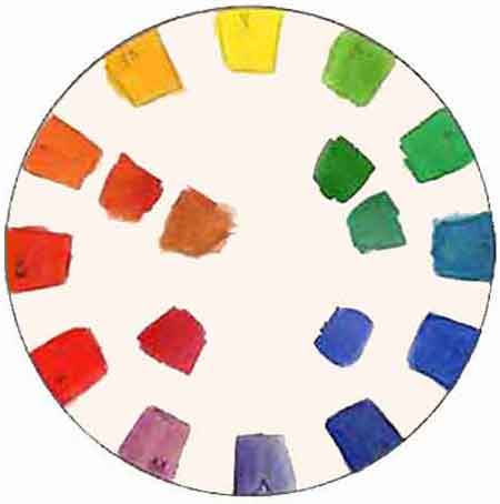 Make a color wheel of your paints.
This seems like a bit of work, but believe me it is very worthwhile.
Paint the color wheel with the colors you use the most often.
Poster board or any heavy type of paper will work for oil paints. Watercolorists use watercolor paper.
There are twelve colors on the color wheel. Paint a warm and cool version of each of the six basic colors.
There was still a debate in my mind about exactly which colors to use. So, the colors out in the middle of the wheel were some of the alternate colors still on my palette.
#2 Make Color Scheme Templates
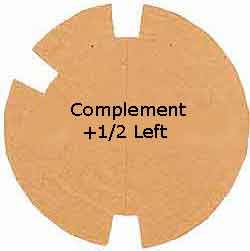
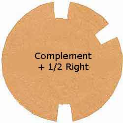
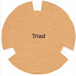
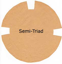
Cut out color scheme templates the same size as your color wheel.
These are the templates I cut out of newsprint years ago. Today I still use these same templates to choose the paint colors for each individual painting.
See examples of my paintings from these color schemes.
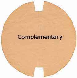
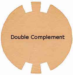
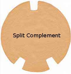
the following two schemes are the ones I use most often.
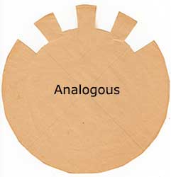
#3 Choose the Colors for a Painting
Now comes the fun part!
First - Select the main color of the focal point. The focal point is our reason for doing the painting.
What do we want to convey in each painting. Do we want a happy painting or a sad painting, a bright or somber one, do we want nature's natural colors, etc. Select the main color accordingly.
Second - Look for the second color.
How to Find the Colors?
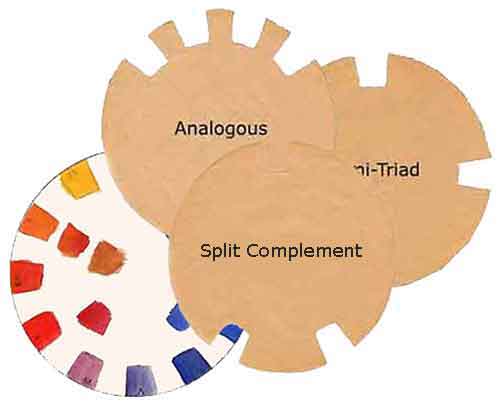 Start selecting the colors.
Individually place each color scheme template over the color wheel. Place each template so our selected focal color shows through a cut-out in the template.
The second color we choose will almost always be a complementary color. Monochromatic and analogous color schemes are exceptions.
A scheme with complementary colors will make it easy to mix neutral, dark colors for the painting.
The mixed colors will always harmonize with the rest of the painting. They won't look out of place because they came from the original color scheme.
Third - Choose an additional color. This color will normally be used in the smallest amounts in the painting.
Some painting color schemes may include another color or two like the analogous scheme.
Choosing Colors for the Sea Turtle Painting
 A harmonious painting of only 3 colors.
Here is how I chose the painting color scheme for the turtle painting.
First, I chose orange-red for the focal point, turtle. I used Burnt Sienna for the orange.
Second, the complement blue-green was the perfect color for the tropical water. Mixing the two colors made the dark colors on the turtle and the ocean floor.
A third color, yellow was great for the sunlight and the highlight areas of the painting.
After we select a painting color scheme, we will know what colors to put out on our palette.
Note, a straight complementary color scheme will consist of only two colors. But we can mix a huge number of colors from two complements.
Get Ready to Paint
Paper clip the template to your color wheel.
Only the
selected colors will show.
Refer to it and lay out the colors on your palette.
Keep the color scheme in sight while painting, as a reminder to not use any other colors. If we want more colors, mix them from your selected color scheme.
A color scheme of limited colors will keep us on track, so we don't paint a bunch of confusing colors.
It will will always make a painting with cohesiveness and color harmony.
Today I still use the same color wheel and templates when I get ready to choose colors for a painting.
If it works for me, it will work for you!
Choose Paint Colors Like the Professionals
- Make a color wheel from your paints.
- Make and use the templates to choose your painting colors.
- Enjoy the pleasure of harmonious paintings.





 You can create good art using the big three! Understand how to paint good art with good composition including a focal point, values and color choices. Learn how to use these three important fundamenta…
 How do we create a focal point in art? Where do we put the focal point? How do we find the focus of an artwork? Should all paintings have a center of interest or can they have more than one? Learn fro…
 Create stunning beach art with this step-by-step tutorial. A comprehensive guide on how to paint a beach. It only takes five colors to paint this seascape. Learn the steps of painting the easy backgro…